IV. The Art of Pressure: Willie Cole’s Beauties
- Jennifer L. Roberts, Elizabeth Cary Agassiz Professor of the Humanities in the Department of History of Art and Architecture, Harvard University
In 2011–12, Willie Cole worked with the Highpoint Center for Printmaking in Minneapolis on an ambitious series of twenty-eight large prints that were made by stripping, crushing, inking, and printing ironing boards (cat. nos. 41–63 ). Collectively titled “The Beauties,” each print bears a woman’s name from the era of Cole’s grandmothers: Anna Mae, Bertha Mae, Bessie, Calpurnia, Carolina, Clara Esther, Dot, Emma, Eva Mae, Fannie Mae, Ida Mae, Jane, Jesse Mae, Jonny Mae, Lilly, Lucy, Lula Bell, Mammy, Matti Lee, Pearl, Queen, Rose, Ruth, Saphire, Sarah, Savannah, Willy Mae, Zeddie.
These unsettlingly beautiful works represent the culmination of more than thirty years of Cole’s intensive engagement with the steam iron as tool and motif. Ironing, and its entanglements with the history of domesticity, servitude, embodiment, refinement, and power, has been a part of the artist’s life since his childhood in Newark, New Jersey, where his grandmother and great-grandmother worked as housekeepers and often asked him to fix their steam irons.1 The iron entered Cole’s mature artistic work in the late 1980s, around the time of his pivotal artist residency at the Studio Museum in Harlem, when he had a transformative encounter with a crushed iron in the street: “I saw a discarded iron. It had been run over by a car or a truck and left right in the middle of the highway. The magic occurred the moment I looked at it and noticed that it was looking at me too. I picked it up. It was no longer an iron but an African Mask.”2
Since that original moment of metamorphic displacement (from appliance to mask), the tools of ironing have recurred regularly in Cole’s sculptures, prints, and paintings. Over the years, Cole has increasingly highlighted the capacities of the steam iron as a complex associative trigger. For example, exploiting the resemblance between the design of ships and the bow-pointed shape of ironing boards and the iron’s heated base or “sole plate,” Cole fused the themes of ironing with those of shipping and passage in his monumental Stowage (1997) (fig. 4.1).
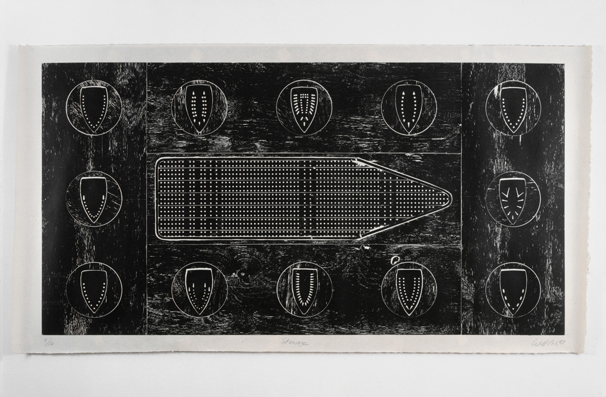 Figure 4.1
This print forever equated the ironing board with the iconic eighteenth-century diagram of the slave ship Brookes and the trauma of the Middle Passage in the Atlantic slave trade. Cole also continued to cultivate resonances between iron iconography and African art and history: shields, masks, scarification practices, and sculpture (fig. 4.2). Drawing particularly on Yoruba religious traditions, he highlighted the elemental associations of iron and steam, invoking Ogun, warrior and spirit of metalwork (god of iron), and Shango, god of thunder and lightning. At the same time, he cultivated the resemblance of the sole plate to the Gothic arch and the veil of the Virgin of Guadalupe in works such as his Virgin of Enlightenment (ascending/descending) (cat. no. 86 ).
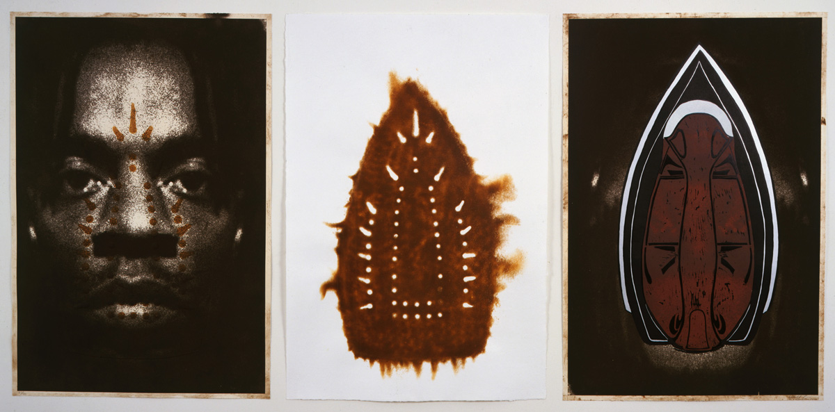 Figure 4.2
Using irons as printing and scorching tools, Cole viscerally evoked the practice of branding in the slave trade while simultaneously exploring the meaning of “branding” in modern merchandising—cataloguing the unique steam-vent patterns that differentiate a GE from a Silex from a Sunbeam. Looping back to connotations of scarification, he associated these advertising “brands” with African traditions of marking tribal identity.3
As should already be clear, the meanings Cole has elicited from the iron over the years have often been blatantly contradictory: simultaneously positive and negative, violent and transcendent, connecting seemingly incompatible spheres of meaning and activity. And all along, the original connection to the domestic labor of Cole’s grandmothers has endured. Merging with all of these other associations, their laundry work is now unforgettably charged with the scope of global historical economies, politics, and religions, and their traditionally feminized domestic labor has become inseparable from the traditionally masculine sphere of founding and blacksmithing—along with the power and danger of fire and steam.4
It is in the “Beauties” project that Cole has attested most directly to the link between the iron motif and the domestic labor performed by generations of Black women in America. With the Beauties, the themes and associations that swarm around iron, irons, and ironing reach a new intensity. For viewers, conflicting associations shoulder their way in, each refusing to yield to the others: the prints are slave ships, tombstones, portraits, shrouds, windows, monuments, shields, X-rays, and more, all at once. Rapidly oscillating between associations of violence and beauty, precarity and permanence, matter and spirit, the prints reject any single or synthesizing interpretation.
The series achieves all this, I will argue here, by maximizing the
resonances of printmaking and its connection to pressure. Printmaking
plays a self-referential role in the project (making the Beauties with a
printing press underscores the pressing that they evoke) while also
generating the project’s profusion of simultaneous external references.
Printmaking’s unique way of harnessing materials and forces inserts
fundamental forms of ambiguity into the core of the project: the
crushing pressure of the press paradoxically expands the images and
holds them open to the juxtapositions they compel. In other words, in
the materials and the making of the Beauties, the very conditions for
their significance are established. There is, we might say, a
specifically printerly intelligence running through these works—one
that is closely related to the intelligence of Cole’s grandmothers as
they labored over their ironing.
Making the Prints
The “Beauties” project developed from a long process of material and conceptual exploration at Highpoint Editions, where Cole made repeated visits over the course of sixteen months.5 Cole Rogers, the master printer at Highpoint, encourages visiting artists to experiment broadly with the materials and techniques of printmaking. Artists collaborate with printers in the studio to generate projects and explore ideas. Fairly early on in his time at Highpoint, Cole decided to pursue printing directly from ironing boards instead of more “typical” surfaces such as etched metal plates or woodblocks. This would allow the ironing boards to create their own images—to serve directly as their own rendering tools.
Printing ironing boards is—to say the least—uncommon, so a series of experiments followed. At first, Cole envisioned a huge print, incorporating impressions from a few boards arranged on a wavelike ground, strongly emphasizing the slave-ship associations of much of his previous work. During Cole’s first visit to Minneapolis, several ironing boards were printed and test layouts made, but nothing was resolved. Rogers and his team decided to spend a few weeks perfecting the process of printing the boards; they prepared and proofed a wide range of them in anticipation of Cole’s return a few months later.
When Cole arrived at Highpoint for his second visit, the printers had tacked proofs of individual boards around the studio perimeter for him to examine. He was immediately struck by the way the tall, narrow format of the proofs amplified their latent anthropomorphism and multiplied their cultural and visual associations (fig. 4.3). It was this anthropomorphic association that inspired Cole to conceive of his project as an explicit testament to the women of his grandmothers’ generation. He called his mother from the studio to begin gathering the names of women in his family history. He then researched naming conventions for Black American women in the early to mid-twentieth century and eventually settled on a name for each of the twenty-eight prints.
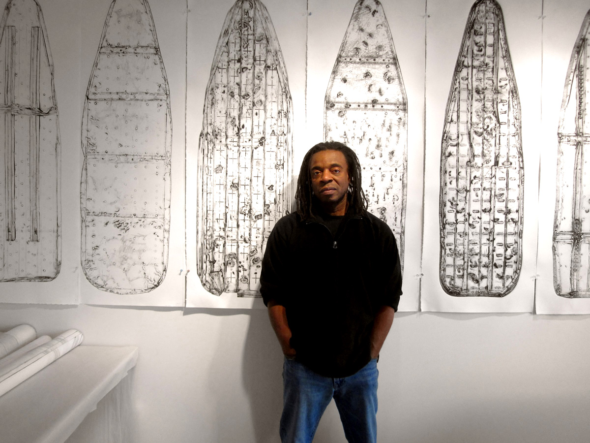 Figure 4.3
How were the boards printed? First they had to be acquired—a project in itself. As the printers and interns at Highpoint began shopping for ironing boards in local stores, they realized that all the boards they could find were identical in shape, in rib structure, and in steam-hole pattern. (Apparently all were made in the same Chinese factory.) Seeking variety, the team scoured Craigslist and thrift shops in the Minneapolis area and were eventually able to assemble twenty-three vintage boards. These twenty-three yielded twenty-eight prints: five were printed twice, once from each side. Queen (cat. no. 67 ) and Lucy (cat. no. 53 ), for example, were pulled from the same ironing board—Queen from the top and Lucy from the bottom.
The boards had to be flattened to pass under the roller of the press. The flattening began crudely, in a process that also gave each board a unique patination of scratches, incisions, and dents. In the parking lot behind the studio, Cole and the printers battered the boards with hammers and sledges of several shapes and sizes; as they did so, the boards also picked up marks from the asphalt and gravel below them (fig. 4.4). Then many of the boards were tied to a rope, topped with cinderblocks, and dragged around the blacktop to increase the surface scratching. At several points, Cole himself provided the weight, sitting or standing on the boards as a Highpoint intern pulled him around the lot. Cole later recalled, “We destroyed them. We surfed them down hills and hammered them out. We even ran trucks over them to give them a little more history. … I think of them as ironing board warriors.”6 At the time this process was being devised, Cole and the printmakers were still exploring the idea of using the printed boards in a composition with maritime associations. In other words, they were thinking about the boards as ships. This is important to note, especially with the knowledge that the prints would eventually receive names, because it is difficult to contemplate the flattening process without addressing its inherent violence. Part of the power of Cole’s project is that it absorbs and confronts the violence it evokes, even if only retrospectively.
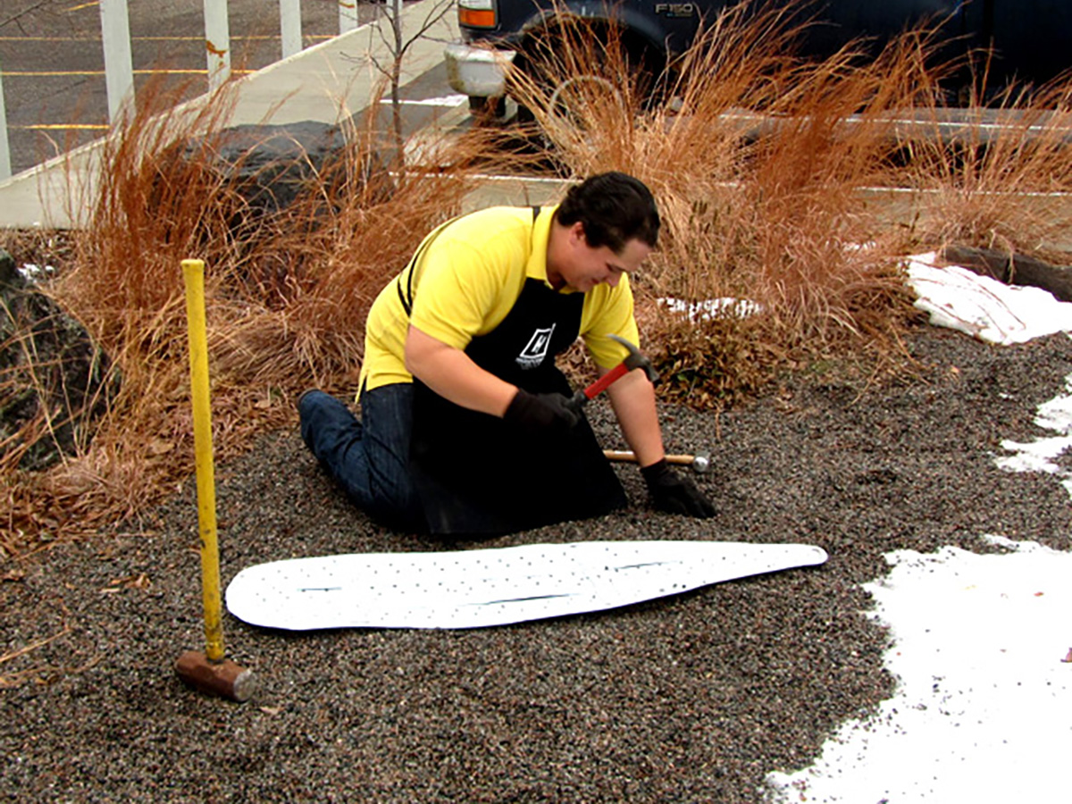 Figure 4.4
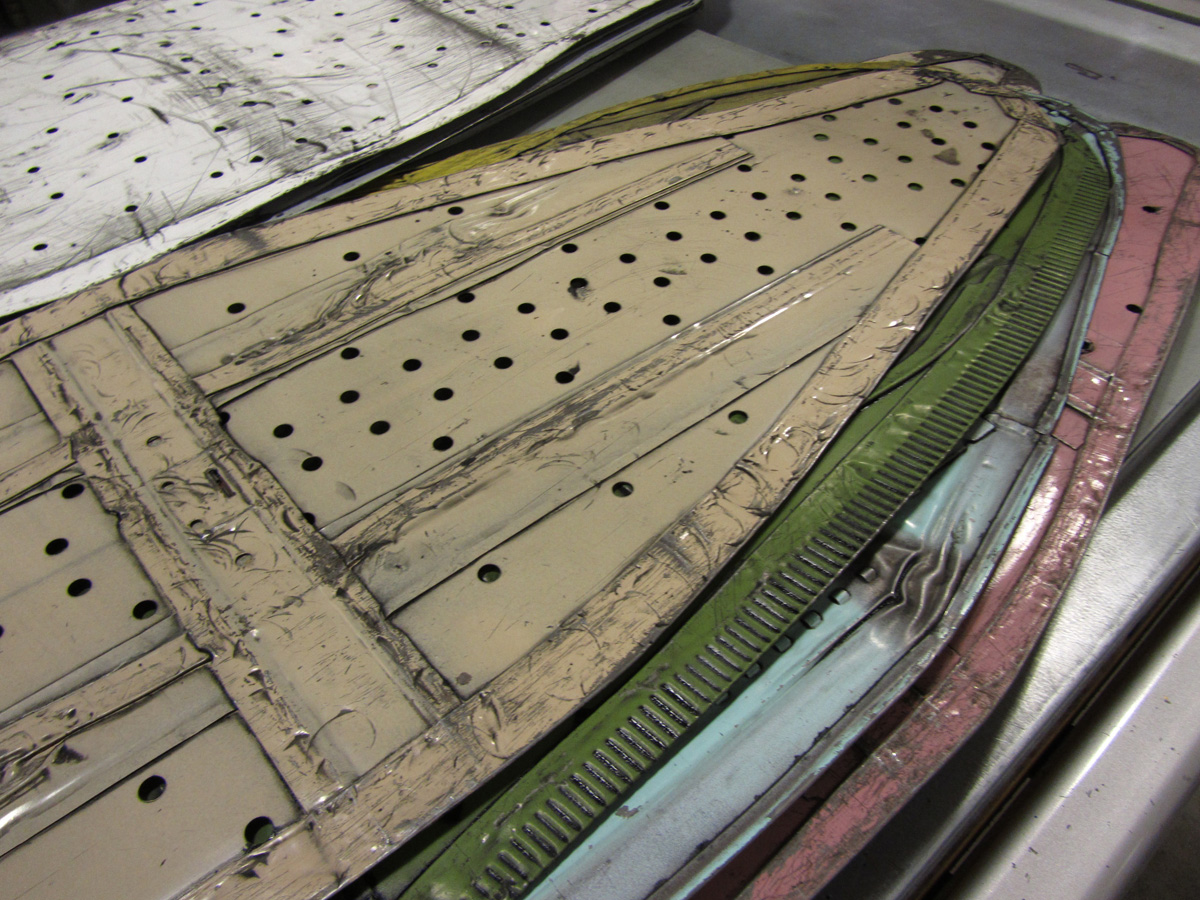 Figure 4.5
To complete the flattening process, the printers placed each board between two sheets of Masonite and ran it back and forth through the press multiple times, slightly increasing the pressure at each run. By now each board was about 3⁄16 inch (4–5 mm) thick, with all its three-dimensional extensions (the lip around the edge, the struts and connections that once joined it to its legs) folded or crumpled into this thin space (fig. 4.5). Each board had its own specific topography of marks: some shallow, some deep, some sharp, some blunt. Each still retained much of its original surface paint. (All ironing boards are painted to protect against rust caused by steam iron moisture.)7
Now each steel ironing board, with its pattern of depressions and incisions, had become a printable that could be treated in essentially the same way that any plate (such as an engraved or etched copperplate) would be handled in a traditional print shop. First the printers distributed dense black ink over the boards with a plastic spreader. Then they worked the ink further into the topography of each one with a bristle brush.
Intaglio printing works by depositing ink in the crevices of a plate and using pressure to force dampened paper into those ink-filled depressions (the “valleys”). For this to create a legible image, the ink sitting on the high areas of the plate (which are meant to appear as white or blank space on the final print) must be removed. This process is called wiping, and it is a highly skilled operation, because the ink must be coaxed off the surface of the plate without also pulling it out of the crevices. The printers at Highpoint did this with a succession of tarlatans (loose-weave cloths heavily sized for stiffness).
Then the boards were ready to print. First a sheet of Masonite was placed on the press bed, then a sheet of Mylar, then the board, then the dampened paper, and finally the felts (fig. 4.6). Multiple hands were needed during the pass through the etching press: the paper and felts had to be kept taut and straight, and the nose of the board had to be held still as it entered the rollers—any small deviation or gathering at the nose end of the print would create creases that would travel throughout the length of the print. Like ironing itself, the printing process involved careful avoidance of wrinkles and creases.
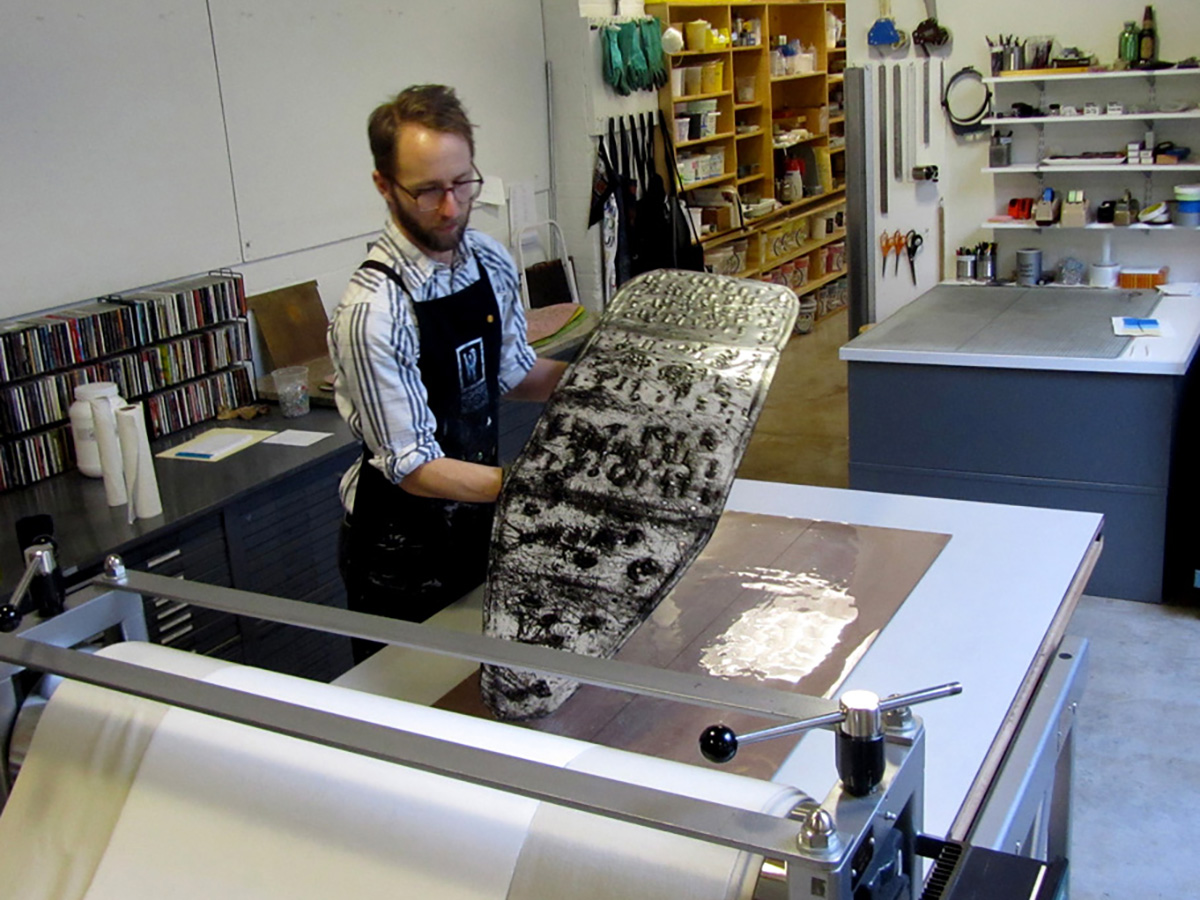 Figure 4.6
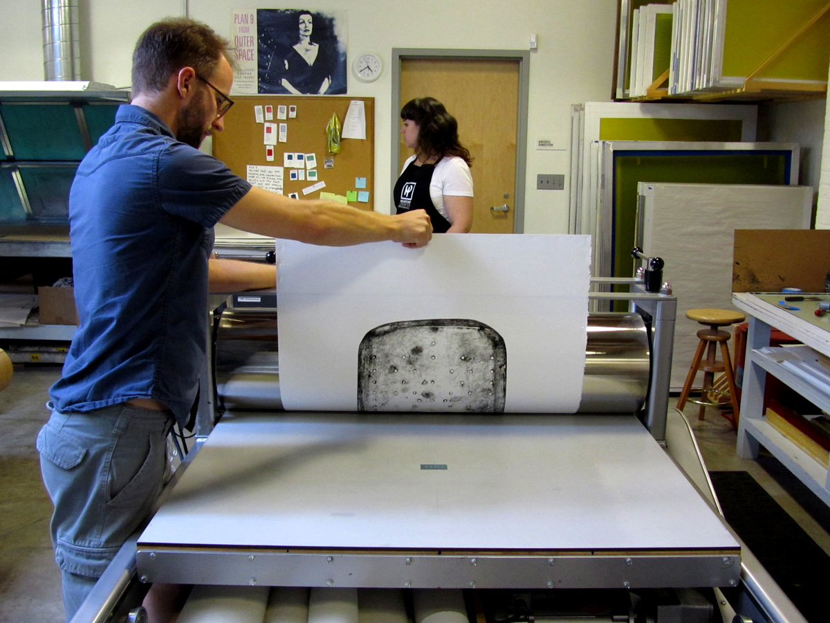 Figure 4.7
After drying, it was time to print the names at the base of each print.8 Unlike the intaglio boards, the names were printed in relief, a process that takes ink from the top surfaces of a plate rather than the valleys. Small plastic relief plates were generated from stencil forms and gently inked in a flat gray. To minimize the chances of misalignment, the existing print was rolled back through the press cylinders until only the “tail” remained; then the relief plate was positioned and printed as the remainder of the paper passed through (fig. 4.7). Here, unlike the massive force used to flatten and print the ironing boards, the pressure was very light—just enough to pull the ink off the top surfaces of the letters but not enough to pick up any indentation from the plate a millimeter below. The common term for this is the “kiss .” So although the ironing boards entered the print studio violently, they left it, as the prints received their names, in a gesture suggesting affection and intimacy.
Cole grouped five of the prints—Savannah, Dot, Anna Mae,
Queen, and Fannie Mae (cat. nos. 64–68
)—to be offered as a set titled “Five Beauties
Rising,” which was printed in an of nine. The other twenty-three
were released in an edition of only three each.9
Posture and Pressure
These details of the printing process are not mere technicalities; rather, they are precisely what allow the Beauties to signify so broadly and eloquently in the realm of culture, politics, and ideas.
First of all, the pressure in the printmaking process creates essential postural ambiguities in the prints. Their names, narrow vertical proportions, and “standing” format strongly recall aristocratic portraiture in the West, helping to account for the hieratic, dignified bearing the prints assume. Queen, for example, standing tall with her flaring, folding contour and elaborately patterned surface, recalls any number of beskirted royals in the history of aristocratic representation (figs. 4.8 and 4.9).
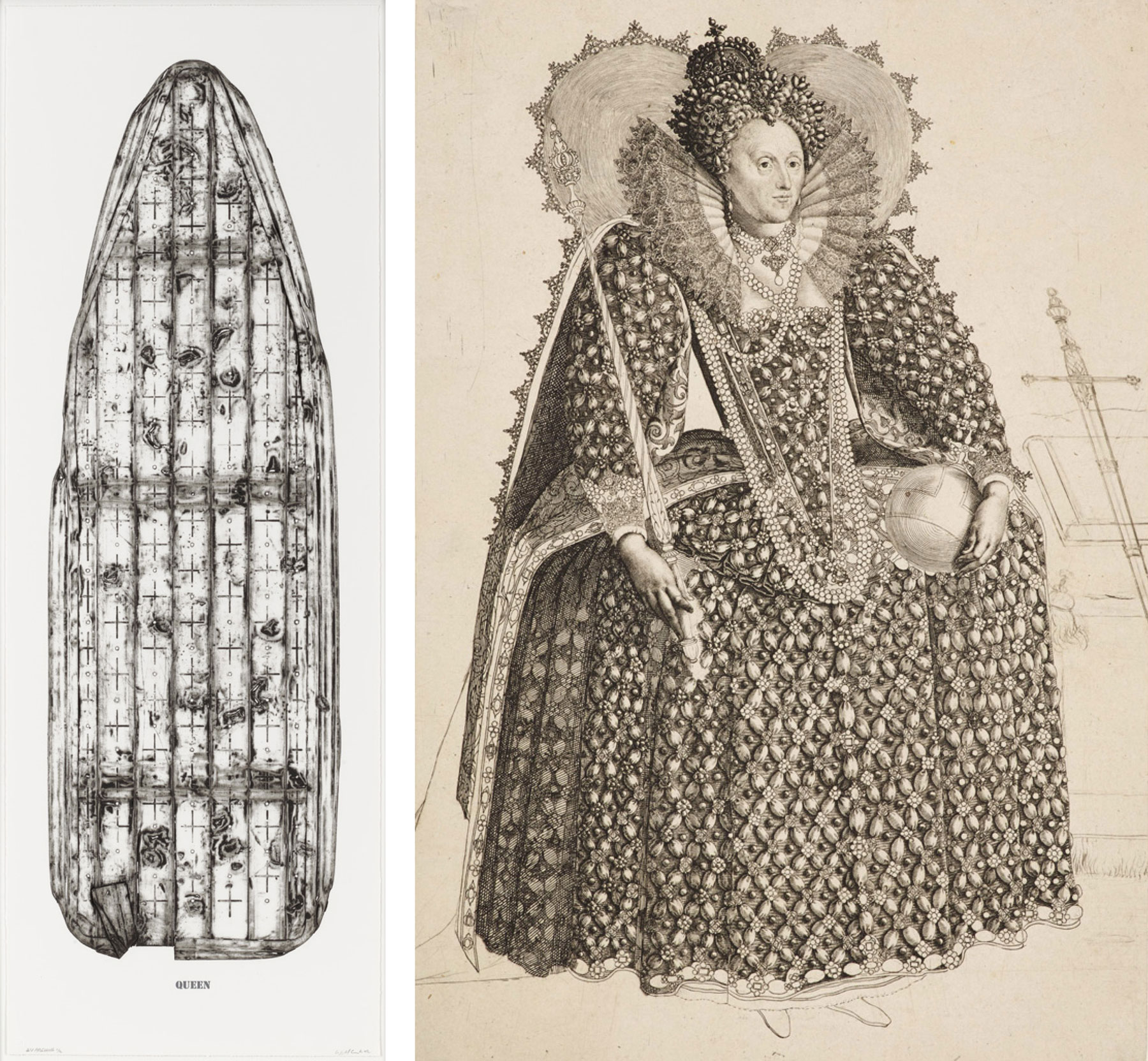 Figures 4.8 and 4.9
RIGHT (fig 4.9): Crispijn de Passe the Elder after Isaac Oliver, Elizabeth I, c. 1603, engraving with etching and drypoint (trial proof), 12 3⁄16 × 7 13⁄16 in. Royal Collection Trust / © Her Majesty Queen Elizabeth II 2019
And yet a contravening spatiality inserts itself into the experience of these works, precisely because they are prints. A full-length portrait typically results from a scene of uprightness: an artist standing at a standing easel, perhaps, painting a standing figure at ease. But the Beauties emerge from entirely different forces and orientations. The boards lie prone, under enormous pressure, on the press bed. The image transfer that creates the prints occurs along a horizontal plane. Unlike a freestanding portrait subject, the Beauties are exposed and subjected to elemental forces along all their primary surfaces.
An ironing board’s posture in its normal domestic condition is similarly horizontal and subordinate: it’s a flat surface whose job is to support and order a task from below as well as to withstand pressure (and heat) from above. Needless to say, the fundamental horizontality of ironing, with its connotations of work, force, repetition, and “low” matter, generates associations entirely different from the airy ease of the standing aristocrat. The material evidence of this horizontality remains conspicuous in the Beauties themselves: the strong embossing and debossing of the paper along the incised areas and board edges (the result of the deformation of damp paper against the topography of the ironing board “plate”) inevitably convey these impressions of force and resistance (fig. 4.10).
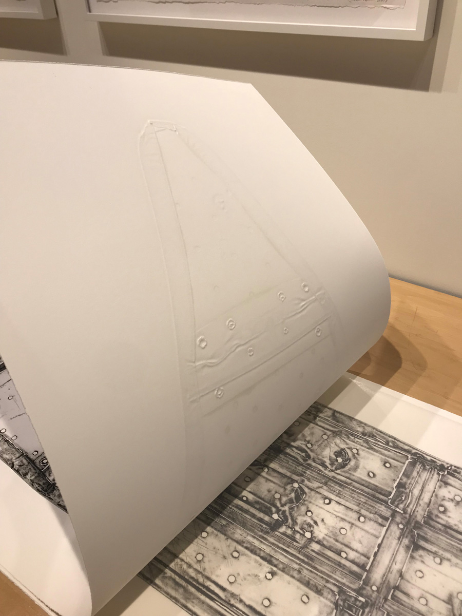 Figure 4.10
The ambiguities raised by this clash of simultaneous postural associations (horizontal or vertical?) also impinge on the most basic tasks of visual interpretation and identification. Consider the upper contour of Queen, which resembles the draping fall of a fabric veil (gravity pulling from top to bottom) and yet also clearly derives from a piece of crushed metal that has been shaped by forces working in a perpendicular direction. These ambiguities also create fundamental terminological confusions that make the prints difficult to describe, because they have no stable orientation in space. It seems that we should call the image we see when we stand in front of Queen the “front” or “face” of the print. But it actually comes from the “back” (or perhaps the “top”) of the ironing board. Front? Back? Top? Bottom? Recto? Verso? Dorsal? Ventral? Queen’s postural and prepositional signals are forever crossed.
When the Beauties assume their portrait orientation on the wall, then,
their origins in the press accompany them, charging their dignified air
with memories of (literal) oppression. This emphasizes the endurance,
resistance, and precarity behind their standing, rather than any easy
sense of unfettered aristocratic privilege. They don’t just stand;
they withstand.10
The Wound-Image
There is a sacrificial quality to the marks on the Beauties: the hammering, dragging, gouging, and crumpling of the original ironing boards produce physical evidence of violence that transfers directly to each print. Given the anthropomorphism of the prints, in which the boards stand for bodies, each inky mark reads as either a scar (the embossing, resembling raised scar tissue, amplifies this association) or the image or impression of a wound—like a bandage that holds the reverse image of a cut when it is pulled off.
Here the direct connection between wound and image in these prints has a long history in foundational ideas about print in the West. Consider the sudarium, or veil of Veronica, an iconic motif in Western Christianity since the Middle Ages. According to tradition, after Saint Veronica stopped to wipe the blood and sweat from the face of Jesus along the way to Calvary, a miraculous image of the face remained on the cloth. Early modern printmakers unsurprisingly took this as emblematic of their own work, which after all involved cutting and scratching into one body (a block or plate) and transferring a viscous image from it onto another surface through contact alone (fig. 4.11). All prints are essentially contact relics in this sense, physical echoes of damage done to a matrix, and Veronica’s veil simply underlines the essential qualities of the medium.11
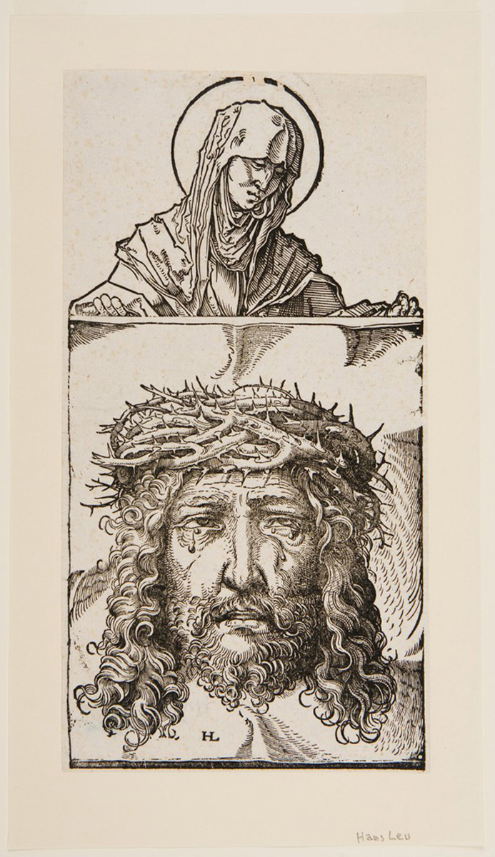 Figure 4.11
Cole’s work immediately seizes this model of the wound-image and extends it to African American and women’s history, raising the specter not just of the wounded Christ but of the scarred or wounded body of an enslaved person or a victim of other forms of overt or latent racial or gender violence. Yet here, too, are inescapable ambiguities in the tone and meaning of these incisions. They appear not just as horrors but also, as their name reminds us, as beauties. In particular, the markings have a decorative quality about them. Steel crumpling around a hammer strike creates a depression that looks like a rose when inked and printed. The resemblance of the boards’ contours to dresses or robes amplifies these associations: the pattern of the marks in many of the prints recalls the ubiquitous flowered housedresses of the mid-twentieth century—for if printing has essential connections to wounding, it also has essential connections to pattern making and decoration. Some of the earliest printing techniques in the world were used in textile design, with its need to repeat patterns and motifs over large areas. (The movement of printed textiles around the globe, like the movement of enslaved peoples, was an essential driver of modern global imperialism.) Cole has long been interested in pattern design and textile printing, both African and Western, and this too comes through in the Beauties.12
Moreover, as Cole’s other work with the steam iron and its patterns has
made clear, scarification, tattooing, and other flesh-marking traditions
have strong positive associations in many African cultures, where such
bodily modifications denote beauty and refinement.13 And just as
prints make beauty from cuts and gouges, scars announce both the
presence of a wound and the action of healing, both the body’s passive
reception of an external injury and its active remediation. Veronica’s
veil, as a relic, was said to have healing powers for all who touched
it.
Revelation
One of the paradoxical qualities of intaglio printing is that although it involves opaque plates that transfer marks in the close, dark space of the press, that profoundly blind material operation can generate pictorial effects of lightness and transparency. This is not just because a printing press can create pictures of ephemeral things such as angels and clouds. More fundamentally, it has to do with the unique way the press perceives and transmits information about texture and topography.
This paradox is exemplified by the Beauties. Standing in front of Jonny Mae, for example, we know that we’re looking at an imprint taken from just one side of the board, which is a solid (if perforated) sheet of steel (fig. 4.12). Yet we have the strong illusion of being able to see through it, as if it were made of translucent material: it looks like an X-ray or a stained-glass window.14 We can clearly perceive the pattern of struts and supports that occupy the other side of the board: two strong vertical lines and two horizontal, each darkening against the pattern of the facing front surface.
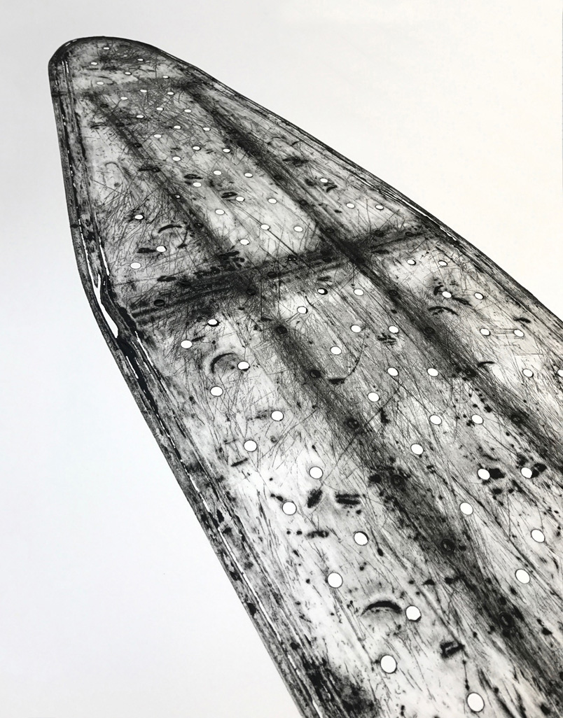 Figure 4.12
How is this possible? To understand this effect, we must appeal to the physical exigencies of printing. At Highpoint, the struts were left attached to the boards as they were flattened. Crushed against the bottom of a board, they made that portion of the “printing plate” thicker, altering the topographic disposition of the top side. The thicker parts of the board picked up scratches and dents more readily during the patination process, and thus held more ink when printed. Also, when the board was printed, the thicker areas of the plate drew more pressure from the roller, further darkening the corresponding areas of the print.
A similar effect occurs in Queen. The struts behind the surface are clearly visible, and indeed, the print is so full of exquisite incidental detail around these struts that it resembles a Rembrandt etching, with its wide variation in sharpness, tone, and scale of the marks. The matrix itself (the board) is surprisingly reticent by comparison (figs. 4.13.1 and 4.13.2). The press, we might say, “sees” the back of the ironing board far better than does the human eye. Printing is a haptic art, an art of pressure, and its elements—plates, felts, the press itself—are designed to respond with maximum sensitivity to minute changes in texture and topography that are invisible to the eye. This is common knowledge among printers, who routinely witness the enormous difference between the way a matrix looks in itself (the way it is interpreted by the human eye) and the way it looks when it is printed, or “interpreted,” by the press.
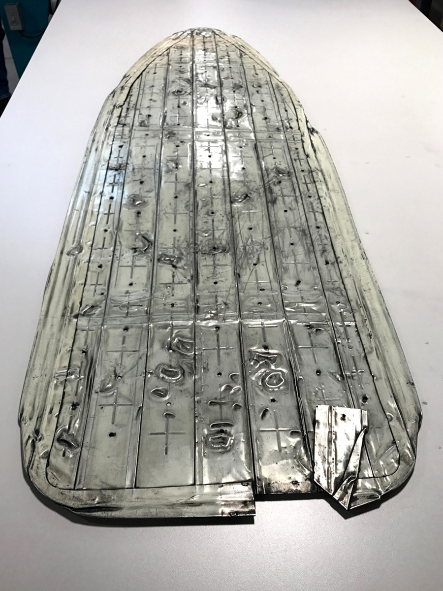 Figure 4.13.1
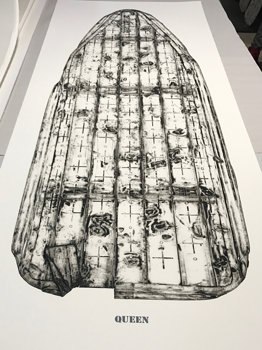 Figure 4.13.2
Again, this effect of optical transparency and visual evidence results from blind physical forces. Prints like this are not so much examples of “visual art” as they are visualizations—translations of the invisible into visible form, producing new information and new forms of interpretation and awareness. Hence the significance of the Beauties’ connection to the X-ray, a visual technology that is usually used to reveal or diagnose internal wounds or injuries hidden from view. (Given the liturgical references and the connection to wounding, blood, and textiles, one can’t help thinking of the famous X-ray photograph of the Shroud of Turin.)
The press thus holds a strong forensic power in its ability to manifest
the insignificant, invisible, or overlooked—its ability to expose
what is hidden, whether that means the skeletal underside of the board
or the tiniest scratches and insults to its surface that might otherwise
go unnoticed. There is a truth-telling quality about printing; no wonder
the first prints pulled from a plate are called “proofs.” Considering
that these prints are about revealing the overlooked in so many ways,
Cole could not have chosen a more powerful medium of perception, memory,
transfer, and testimony.
The Art of Ironing
What does all this mean for the women whose figures are evoked by these prints? Let’s linger for a moment on the word “figure.” By enrolling printing and pressure in such a resonant way, Cole and the printers at Highpoint have created a remarkably rich and complex contribution to the history of figurative art. The “Beauties” series solves multiple problems that have driven the history of two-dimensional figuration for centuries: How to show the whole body at once, front and back? How to both evoke a likeness (a record of external appearance) and capture the internal life of the subject? How to create a sense of presence while also evoking the past? And—to raise a special problem that has plagued the history of representation in the United States—how to represent the Black subject without reanimating stereotypes or provoking an attitude of judgment or surveillance? The Beauties put forth a new form of figurative imagination, one that fuses elements that are normally segregated—back and front, inside and out, freedom and oppression, present and past—letting the two sides of these oppositions stand together without attempting to synthesize them into pat generalizations.
But it is not only Cole’s imagination or the printers’ expertise that these prints exhibit. This essay has proceeded so far in accordance with the default assumption that the Beauties are portraits of women. The power of printmaking, it would seem, has created an especially rich image of the women Cole remembers from his childhood: their suffering, their labors, their resistance, their endurance.
But is that the extent of their referential range? Do the ironing boards really represent the women whose names sit below them? Not necessarily. Imagine the following scenario: It is 1968. Ida Mae is ironing a dress shirt for the white man for whom she works as a domestic. She places the wrinkled collar over the neck of the board, stretches the back of the shirt across the top, and begins passing her steam iron across the fabric. The ironing board supports the pressure and heat she applies and guides her actions so that they remain congruent with the shape of the shirt and the body that will wear it. Here the ironing board is anthropomorphic in the most literal sense: it is formed, shaped, and sized not just to resemble but literally to stand in for a human body.
Whom does the ironing board represent now? For whom does it stand? Not for Ida Mae’s body but for the body of her employer, the body that will eventually wear the shirt. Its neck stands for his neck, or arms, or shoulders; its back for his back, or chest, or side. From this perspective, Ida Mae is no longer the ironing board plate, transformed by Cole’s printmaking process to express a complex set of ideas and affects. Now she is the artist-printmaker, wielding the creative and dangerous powers of heat and pressure and commanding the spatial intelligence of printmaking.
For ironing truly does resemble printmaking: not only in its transformative application of pressure, but also in the way it generates parallel forms of cognition and critical insight about bodies in space. Ironing the sleeve of a shirt, for example, is an act of multidimensional fusion: seams and buttons on the back of the sleeve emboss the front as the two layers merge under the heat and pressure. Just as the printing press can generate transparency from pressure, the laundress “sees through” these front and back layers with the iron. Ironing creates an acute awareness of the symmetries and reversals of the body, left and right as well as inside and outside, as garments are turned inside out in order to reach certain areas with the dominant hand, or folded symmetrically in order to iron two layers of fabric at once. Ironing shares, of course, printmaking’s concoction of beauty and violence, pattern and wound. And ironing generates a remarkably complex memory structure—erasing some forms of memory (it imposes a uniform smoothness on clothing that has been shaped by the body) but also imparting memory by changing the structure of fabric, by forming intentional creases, and—as anyone who has ironed an armhole can tell you—releasing latent bodily odors that cannot be perceived under normal conditions. The laundress knows clothing and the bodies that wear it from the inside out and from back to front.
Ida Mae’s name at the bottom of her print may seem to function as a title. But it is also a signature. Ida Mae is not just the printed but the printer, not just a figure but a figurative artist.
The Beauties inspire myriad forms of responsive interpretation. Acknowledging the conceptual and affective complexities that arise from the printmaking process, one might go on to study them through the lenses of critical race theory, feminism, surrealism, intersectionality, topology, geometry, architecture, monumentality, labor history, fashion history, globalization, and so on. Each of these fields might generate new knowledge about the prints, and the prints might challenge and reorganize the shape of knowledge within those fields. But all along, it should be remembered that the knowledge the Beauties inspire began with the insights of Cole’s grandmothers, steam irons in hand.
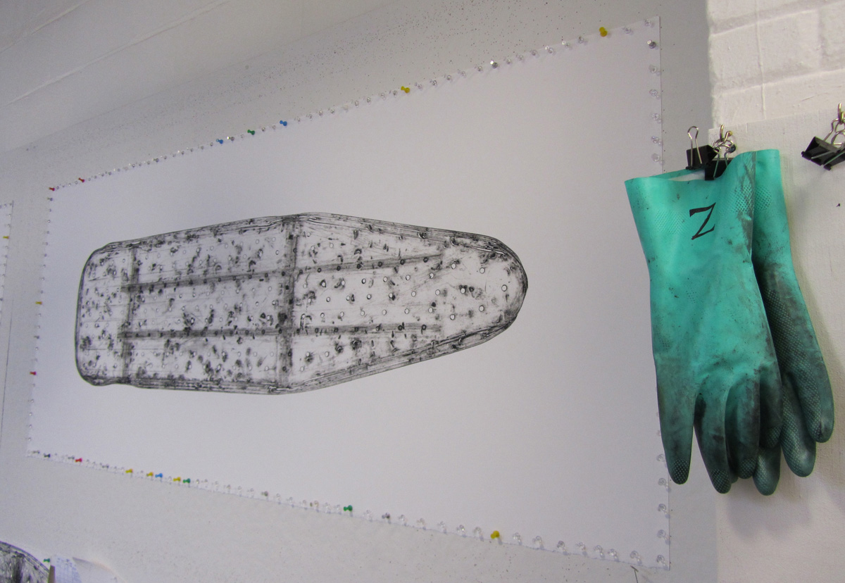 Figure 4.14
Jennifer L. Roberts is the Elizabeth Cary Agassiz Professor of the Humanities at Harvard University, where she teaches American art and the history of printmaking in the Department of History of Art and Architecture. She is currently serving as the Johnson-Kulukundis Family Faculty Director of the Arts at the Radcliffe Institute.
All prints by Willie Cole, made in 2012 at Highpoint Editions, Minneapolis.
Photography: All print and plate photos by David Kern, courtesy of
Highpoint Editions except as noted. Process photography courtesy
Highpoint Editions except as noted.
Notes
Wendy Weitman, New Concepts in Printmaking 2: Willie Cole (New York: Museum of Modern Art, 1998), n.p. ↩︎
“Talking through the Mind Fields: A Conversation between Willie Cole and Leslie King-Hammond,” in Patterson Sims, ed., Anxious Objects: Willie Cole’s Favorite Brands (Montclair, N.J.: Montclair Art Museum, 1996), p. 94. ↩︎
Weitman, New Concepts, n.p.; Sims, Anxious Objects, p. 61. ↩︎
Sims, Anxious Objects, p. 33. ↩︎
Details of the printing process derive from the author’s interview with Cole Rogers, Zac Adams-Bliss, and Megan Anderson, Highpoint Center for Printmaking, Minneapolis, November 15–16, 2018. ↩︎
Willie Cole, quoted in Mason Riddle, “Common Objects/Uncommon Narratives: New Prints by Willie Cole,” in Willie Cole: New Prints (Minneapolis: Highpoint Center for Printmaking, 2012). ↩︎
The patination process at Highpoint removed only some of the paint, and the boundaries between painted and exposed steel took on complex edge conditions that created unique effects in the print. The painted areas also held less plate tone (residual ink) than did the bare steel, meaning that the painted areas of the board tend to correspond to the whitest areas in the print. ↩︎
Each print was dried by pinning it to the wall—pushpins were placed at one-inch intervals around the edge of the print so that the paper would tighten as it dried, like the skin of a drum (see fig. 4.14). ↩︎
Because it was impossible to ink and wipe the ironing boards in exactly the same way each time, they are designated “edition variables” rather than edition reproductions. ↩︎
With their ambivalent gravitational orientation, the Beauties tap into a history of extensive debate and discussion around the role of horizontality in later twentieth-century challenges to the model of the vertical picture plane. For an important review of (and entry in) this discussion, see Leo Steinberg, “Other Criteria,” in Other Criteria: Confrontations with Twentieth-Century Art (New York: Oxford University Press, 1972). ↩︎
An early modern Christian tradition takes up this issue by equating blood and ink in the printmaking process. On this and on the significance of pressure in this tradition, see Elina Gertsman, “Multiple Impressions: Christ in the Winepress and the Semiotics of the Printed Image,” Art History 36.2 (April 2013): 310–37. ↩︎
Sims, Anxious Objects, p. 45. ↩︎
Sims, Anxious Objects, p. 68; Weitman, New Concepts, n.p. ↩︎
Other religious associations erupt from here. The illusion of glassy transparency, the narrow vertical formats, the pointed, arch-like tops of the boards and the mullion-like structure of their supports, strongly suggest Gothic stained-glass windows. The gallery hung with the Beauties thus evokes a nave or a chapel as much as it evokes a galley or a ship. Of course, it also evokes Black churches, as sites of trauma and vulnerability as well as uplift and strength: the horror of the 16th Street Baptist Church bombing in Birmingham, Alabama, in 1963, was frequently illustrated with photographs of the church’s broken stained-glass windows. ↩︎
| words